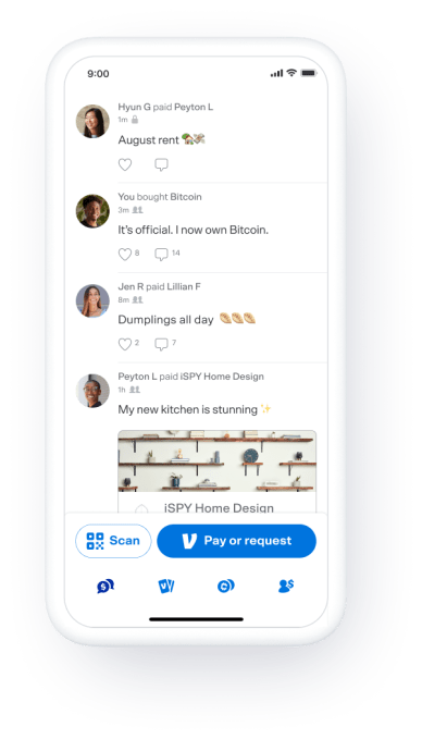
PayPal-owned payments app Venmo will no longer offer a public, global feed of users’ transactions, as part of a significant redesign focused on expanding the app’s privacy controls and better highlighting some of Venmo’s newer features. The company says it will instead only show users their “friends feed” — meaning, the app’s social feed where you can see just your friends’ transactions.
Venmo has struggled over the years to balance its desire to add a social element to its peer-to-peer payments-based network, with the need to offer users their privacy.
A few years ago, the company was forced to settle a complaint with the FTC over its handling of privacy disclosures in the app along with other issues related to the security and privacy of user transactions. One of the concerns at the time was a setting that made all transactions public by default — a feature the FTC said wasn’t being properly explained to customers. As part of the settlement, Venmo had to inform both new and existing users how to limit the visibility of their transactions, among other changes.
However, privacy issues have continued to follow Venmo over the years. More recently, BuzzFeed News was able to track down President Biden’s secret Venmo account because of the lack of privacy around Venmo friend lists, for example. Afterwards, the company rolled out friend-list privacy controls to address the issue.

Image Credits: Venmo
In the newly updated app, Venmo will still highlight this friend-list privacy setting so users can choose whether or not they want to have their profile appear on other people’s friends’ lists. Users will also still be able to remove or add contacts from their friend list at any time, block people and set their transaction privacy either as they post or retroactively to public, private or friends-only. It’s unclear what advantage posting publicly has though, as the global, public feed is gone. Instead, public transactions would be visible to a users’ nonfriends only when someone visited their profile directly.
In addition to the privacy changes, Venmo’s redesign aims to make it easier for people to discover the app’s new features, the company says.
Now, a new bottom navigation option will allow users to toggle between their social feed, Venmo’s products like the Venmo Card and crypto, and their personal profile. The newly elevated “Cards” section will allow Venmo Credit and Debit cardholders to manage their cards and access their rewards and offers, as before. Meanwhile, the “Crypto” tab will let users learn and explore the world of crypto, view real-time trends and buy, sell or hold different types of cryptocurrencies.

Image Credits: Venmo
Venmo first added support for crypto earlier this year, following parent company PayPal’s move to do the same, and now offers access to Bitcoin, Ethereum, Litecoin and Bitcoin Cash. Before, the option appeared as a small button next to the “Pay or Request” button at the bottom of the screen, which contributed to Venmo’s cluttered feel.
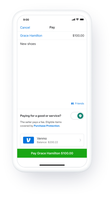
The updated app will also include support for new payment types and expanded purchase protections, which Venmo announced last month, and said would arrive on July 20. Customers will now be able to indicate if their purchase is for “goods and services” when they transact with a seller, which will make the transactions eligible for Venmo’s purchase protection plan — even if the seller doesn’t have a proper “business” account.
Because this now charges sellers a 1.9% plus 10-cent fee, there had been some backlash from users who either misunderstood the changes or just didn’t like them. But the move could help boost Venmo revenue.
PayPal said in February that Venmo grew users 32% over 2020 to reach 70 million active accounts, and expects the app to generate nearly $900 million in revenue this year — likely in part thanks to this and other new initiatives, like its crypto transaction fees.

Image Credits: Venmo
Beyond the more functional changes and the privacy updates, Venmo’s redesign also modernizes the look-and-feel of the app itself, which had become a little dated and overly busy. As Venmo had expanded its array of services, the hamburger (three line) menu in the top right of the old version of the app had turned into a long list of options and settings. Now that’s gone. The app uses new iconography, an updated font, and lots of white space to make it feel fresh and clean.
The app’s changes also somewhat de-emphasize the importance of the social feed itself. Although it may still default to that tab, other options now have equal footing with tabs of their own, instead of being hidden away in a menu or in a smaller button.
Venmo says the redesigned Venmo app will begin to roll out today to select customers and will be available to all users across the U.S. over the next few weeks.
"feed" - Google News
July 21, 2021 at 12:03AM
https://ift.tt/3irqskw
Venmo removes its global, public feed in a significant app redesign - TechCrunch
"feed" - Google News
https://ift.tt/2z3xEQN
https://ift.tt/2yko4c8
Bagikan Berita Ini


0 Response to "Venmo removes its global, public feed in a significant app redesign - TechCrunch"
Post a Comment